The problem in plain terms
I recently asked a portfolio adviser how one retirement projection handled rising prices. The model took an average inflation rate from roughly the last twenty years and applied that one number to every future year. That was one conversation about one tool, and I'm not claiming every fund does this.
A flat rate is easy to explain and easy to compare, and ASIC itself uses 2.5% for that purpose. But real inflation doesn't arrive in equal steps. A forecast that treats every year as 2.5% can never show you a year like 1974, when prices rose 16.7%. I wanted to measure what that costs.
The test household
- A single homeowner, aged 67
- $600,000 in super and $40,000 of other assets, in a balanced mix: about 70% shares and 30% bonds and cash
- A 0.5% investment fee, capped at $350 a year, which is the calculator's usual setting. With a full 0.5% and no cap, the 1974 income below is about $1,000 lower
- Franking credits at 80%, also the usual setting
- The Age Pension included, under today's rules, and allowed to rise 0.3% a year above prices. That is the usual setting. It raises the 1974 income by about $1,100 compared with a pension that only keeps pace with prices
The result is a steady income: the amount you could spend each year, in today's dollars, until the money runs out. It is worked out with hindsight, meaning it assumes you know how markets and prices will behave. Nobody retiring in 1974 knew that, so read these as comparisons and not as promises.
Most of the gap is the average
Someone planning today is not assuming the average will be 7%. The useful comparison is a set of flat rates on this same 1974 retirement. The actual years and a smooth 7% sit beside them for reference.
| How inflation is counted | Steady income |
|---|---|
| The actual inflation of each year | $62,227 |
| A smooth 7% every year (the real average) | $68,115 |
| A flat 6% every year | $71,104 |
| A flat 4% every year | $77,871 |
| A flat 2.5% every year | $83,408 |
A flat 2.5% is about $21,000 above the actual years. About $15,000 of that is the average: those years ran at 7%. Moving from 2.5% to a flat 6% already closes about 60% of the gap. On this ladder, each percentage point of lower assumed inflation is worth about $3,000 to $3,700 a year. The ups and downs take about $6,000 off the smooth 7% row.
So most of what a flat 2.5% gets wrong on this history is the average.
For a plan that really does assume a 2.5% average, the closer check keeps the ups and downs and shifts them so the average is 2.5%. 1974 stays at roughly 12%. That income is about $75,000, about $8,000 (roughly 10%) below a smooth 2.5%. A typical random ordering of that shifted list pays about $83,000, the same as the smooth 2.5% row. So the $8,000 is not the size of the jumps. A random ordering of them costs nothing. What costs money is the order this history happened to have. The method is on the notes page.
The worst start wasn't 1974
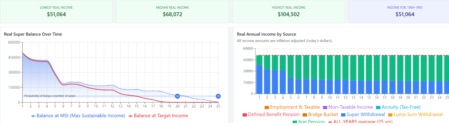
The lowest income in the record, across start years from 1950 to 2001, comes from a 1969 start: $51,064 a year. A $55,000 target is about 8% more than that. It is a shortfall and not a collapse.
I trained as a materials scientist, and the sample you re-examine is the one that came up short. Here that is 1969. It still falls short after the inflation is smoothed.
Why 1969 and not 1974? Put both retirements on the same smooth 7% inflation. The 1969 start supports just under $55,000 and the 1974 start about $68,000. So roughly $13,000 of the gap is down to the investment returns alone. The two windows share 20 of their 25 years: a 1969 start includes 1969 to 1973, and a 1974 start includes 1994 to 1998 instead. 1969's inflation also ran hotter, 7.9% on average. Smoothing that average gives about $53,000, and the bumpy years inside it take another $2,000 off, down to $51,000.
Those figures use the $350 fee cap and the 0.3% pension rise. With a full 0.5% fee and a pension that only keeps pace with prices, the 1969 income is about $49,300, and $55,000 is just over 11% more than that. The same settings leave the 1974 start at about $60,100, still above $55,000.
Does the order of bad years matter?
For a 1974 start, yes, and it is when the inflation came, not which return it met.
Each year in the 25-year retirement carries two figures: that year's inflation rate and that year's investment return. I shuffled them three ways, recalculating income 1,000 times for each. "Typical" below means the median of those 1,000 runs.
| Experiment | What changes | Typical income |
|---|---|---|
| Shuffle inflation only | Inflation rates change order; market returns stay in their actual years | ~$68,000 |
| Shuffle markets only | Market returns change order; inflation stays in its actual years | ~$61,500 |
| Shuffle whole years | Each year's inflation and return stay together, but the years change order | ~$67,900 |
The actual result was $62,227.
Inflation shuffled. None of the 1,000 shuffles did worse than what happened. A typical shuffle paid about $68,000, the same as the smooth 7% row. So the bumps cost nothing on average, and the $6,000 is the order they came in. Swapping 1974's 16.7% with 1988's 7.6%, a typical year, recovered only about $900.
Markets shuffled. A typical shuffle paid about $61,500, a little under what happened, and 554 of 1,000 paid less than what happened. On this path, the real market order costs nothing. The real inflation order costs about $6,000.
Whole years shuffled. This keeps each inflation rate with its own return, and it still recovers about $5,700, about what shuffling inflation alone recovers. So the pairing of high inflation with a weak market year is not what drives the result. The rank is weaker, though: 95 of 1,000 whole-year shuffles paid less than what happened, against none of the inflation-only shuffles. Moving the markets as well widens the spread of outcomes, so what happened sits inside it. That is my inference, not a further test. The inflation-only result is the strong evidence. About one in ten on the whole-year test would not be enough by itself.
None of this proves inflation and markets act separately. A random shuffle is a limited test of how the two interact, and the three results agree without any one of them carrying the conclusion alone.
A counterexample. Early high inflation is not enough on its own. In 1951, the second year of the 1950 stretch, prices rose 23.9% in the year to December, the highest annual rate in the ABS series. The mix was up about 9% before inflation, a real loss of about 12%. Smoothing that stretch still changes income by only about $500. I don't yet know what separates it from 1974.
1969 is different. A typical inflation shuffle paid only about $2,000 more. A typical markets shuffle paid about $55,500, roughly $4,500 more, and 105 of 1,000 paid less than what happened. So the record's low point owes more to its market years than to its inflation years. Roughly $4,500 of it is the order of 1969's own market years. The rest is which years the window contains and the hotter average. That is a rough split, because the comparisons don't share a baseline, and a one-in-ten result is a weak basis for calling it a mechanism. The fair summary is that 1969 was mostly an unlucky run of market years, while 1974's ordering penalty is about when the inflation arrived.
What about the Age Pension?
At the start, the pension is worth only about $8,200 a year, roughly 15% of a $55,000 target, so your savings do most of the work early on. As savings shrink, the pension does more.
Switch the pension off and a 1974 start supports only about $34,000, against $65,000 on a smooth 2.5%. That gap is about $31,000. With the pension on, the gap is about $21,000, so the pension shrinks it by about a third. Without the pension, about $20,000 of the gap is still the average and about $10,000 is the ups and downs. The pension cushions the problem without removing it.
Is this just one unlucky period?
Partly. From 1950 there are only three 25-year stretches that don't overlap.
| Start | Average inflation | Actual inflation | That period's own average, smooth | Flat 2.5% |
|---|---|---|---|---|
| 1950 | 5.2% | $68,730 | $68,203 | $78,398 |
| 1975 | 6.4% | $71,279 | $78,662 | $97,734 |
| 2000 | 2.8% | ~$57,000–$58,000 | ~$57,000–$58,000 | ~$57,000–$58,000 |
In 1950, smoothing that period's own average gives $68,203, about $500 less than the actual $68,730, so the gap to a flat 2.5% is the average. In 1975 the ups and downs cost $7,383, but that stretch overlaps 1974 and is the same inflation episode, not a second confirmation. In 2000 every method lands in the same place, because the average was already near 2.5%, which makes that result close to true by construction.
So 1974, 1975 and the 1969 shortfall are largely one 1970s episode, seen from nearby dates. The loud result is one episode, and the quiet 2000 result is one stretch, not a rule for every calm period.
Across all 52 start years from 1950 to 2001, 49 reach $55,000 on actual inflation. The three that miss are 1968, 1969 and 1970, which are one bad stretch and not three separate failures. A flat 2.5% reaches $55,000 in all 52.
How a flat rate sits beside the record
A flat 2.5% is the figure ASIC uses so one forecast can be set beside another. The historical years show how far a result moves when the average is not 2.5%, and where the high years fall. A projection that only shows the calm version leaves both of those unmeasured.
A flat table can flag a short start once the average is known: smoothing 1969 at its own 7.9% already gives about $53,000, short of $55,000. What a flat table cannot supply is that average in advance.
Notes on method
The calculator has no switch that reruns history at a flat 2.5%. The other rows on this page use the same calculation with the inflation rate changed. The Age Pension uses today's rules, not historical ones. From 1949 to 2024 the inflation figures are December-quarter ABS numbers. 2025 is the complete monthly CPI, up 3.8% over the twelve months to December 2025, from 3.4% to November. Years before 1949 use older rounded figures, so this article compares 1950 onward. The extra checks, the shuffle method, and the 25 inflation rates for 1974 to 1998 are on the notes page.
The bottom line
A flat 2.5% inflation assumption assumes away the two biggest inflation risks in retirement: a higher long-term average and early price shocks. While a single rate is fine for comparing products, it is a poor tool for testing real-world survival. If a retirement model cannot show you a year like 1974, it cannot show you what a bad inflation environment actually costs.
Official sources
- ABS: Consumer Price Index, Australia
- ABS: 70 years of inflation in Australia (December year-ended CPI)
- ABS: CPI, December quarter 2024 (7.8% to December 2022, 4.1% to December 2023, 2.4% to December 2024)
- ABS: CPI, December 2025 (complete monthly CPI, 3.8% in the 12 months to December, from 3.4% to November)
- ASIC Regulatory Guide 276: Superannuation forecasts
- ASIC Corporations (Superannuation Calculators and Retirement Estimates) Instrument 2022/603
- Services Australia: deeming rates from 20 September 2026 (1.75% and 3.75%)
- Social Security (Deeming Threshold Rates) Determination (No. 2) 2026
Open the 1969 start
This is the low point in the record: about $51,000 a year with the pension included, about 8% below $55,000. The screen uses each year's actual inflation. The first Advanced runs are free. Unlimited historical runs and PDF exports are $149 a year, or $14.99 a month ($179.88 over twelve months).
Open the 1969 start →No card required for the first run. Subscribe only if you keep using the full model.